Michelle Bowen
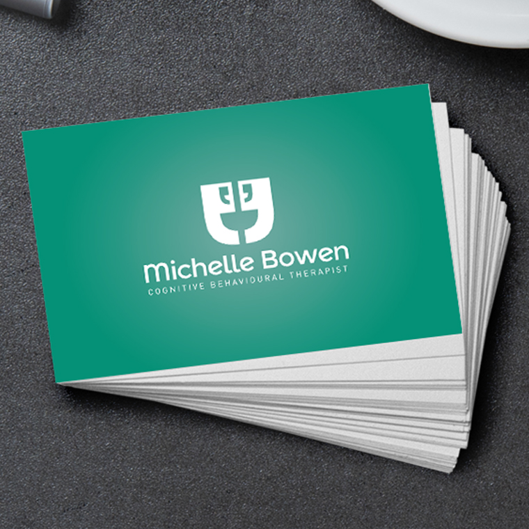
After setting up her business, Michelle was looking to create a brand which she felt was a true representation of her vision to improve the lives of those with cognitive behavioural issues.
The brief was to create a professional looking logo mark that still had a hint of personality in order to appeal to her target audience.
Colour was a big part of the brief as she was very particular as to not use any dark or red based colours. With that in mind I felt a light mint green would suit perfectly as not only is it calming but is also a great representation for progress and moving forward.
In terms of the logo mark I wanted to create something positive so I looked to have the speech marks looking like they were talking to each other but also coming together to make a single smiling face. That allowed me to give the logo mark that little bit of personality that the client was looking for.
Once the logo was approved a set of business cards was designed, as well as some signage visuals for her consideration.

Work produced as part of the allmedia ltd team.