Chapman Dental Solutions
Ever growing denture clinic Chapman Dental approached me looking to rebrand the business before their move to their new, larger premises. Working with a number of dental practices, they desired something more modern and professional looking to really represent the direction the business was heading with the expansion.
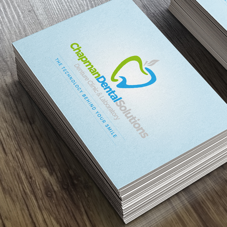
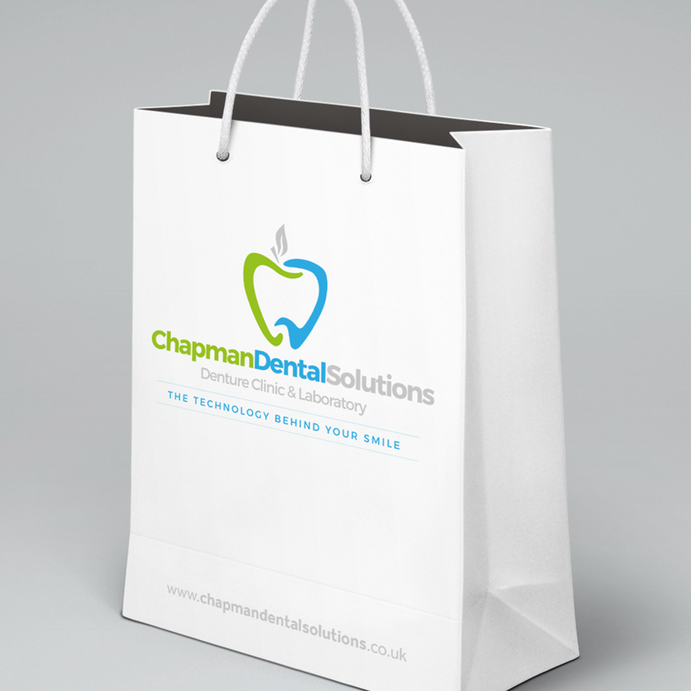
In terms of design the client liked to thought of the apple so I set about creating a logo mark that incorporated the ‘C’ and ‘D’ of the name to make the shape. Giving the words different colours allowed these letters to stand out more prominently in the logo and the blue helped give the business that clinical feel.
Once the logo was approved some simple business cards were produced along with visuals of a number of additional promotion materials.
Check out the guys online at www.chapmandentalsolutions.co.uk