Eriss Property Consultancy
I was approached by Eriss Property Consultants as they had been using their old, and original, branding for a number of years and felt it was time for a refresh.
They were keen to keep the same colours as previous and were after a more corporate look. They also mentioned they’d like a logo element within the logo itself that could be used individually, separate from the main one, as a mark that could be used throughout further marketing materials.
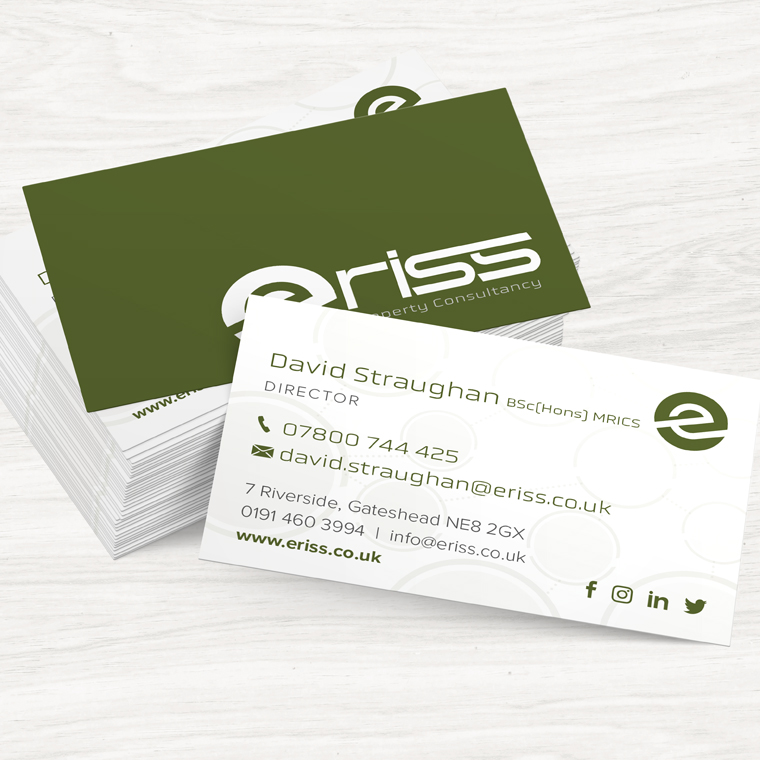
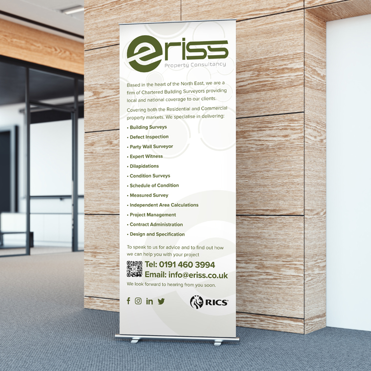
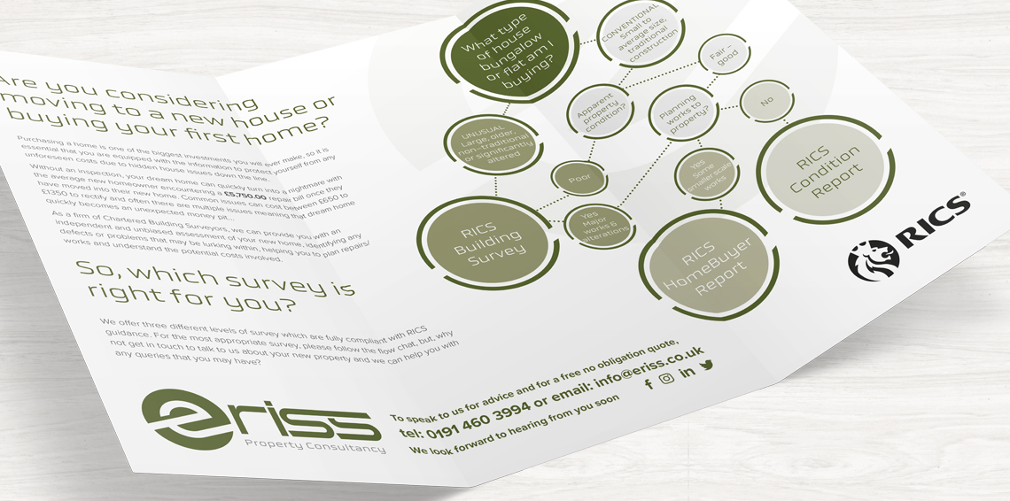
Once the logo mark had been decided I moved it on to a new stationery pack as well as a pop up exhibition banner and some other marketing materials.