Jonathan Mann Developments
Looking to expand their business, Jonathan Mann Developments tasked me with producing their new branding to help aid them in raising their company profile.
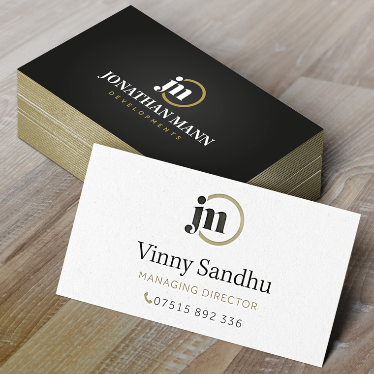
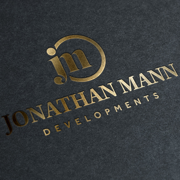
They wanted a clean, professional and up market logo design as they were looking to target a number of high end clients. The combination of the black and gold colouring, companied with a strong serif font really gave the company the look and feel they were going for.
To aid with the exclusive look no expense was spared when it came to print methods with gold edged business cards and gold hot foil pressed folders.
Looking forward to working on future projects with this client including a responsive website design and additional marketing collateral.