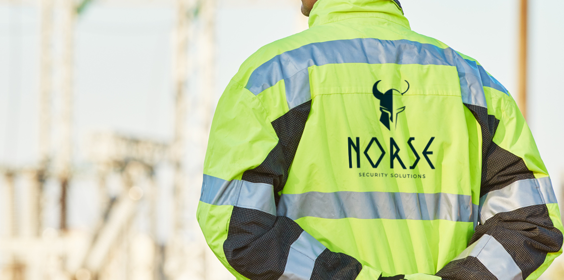
Norse Security Solutions
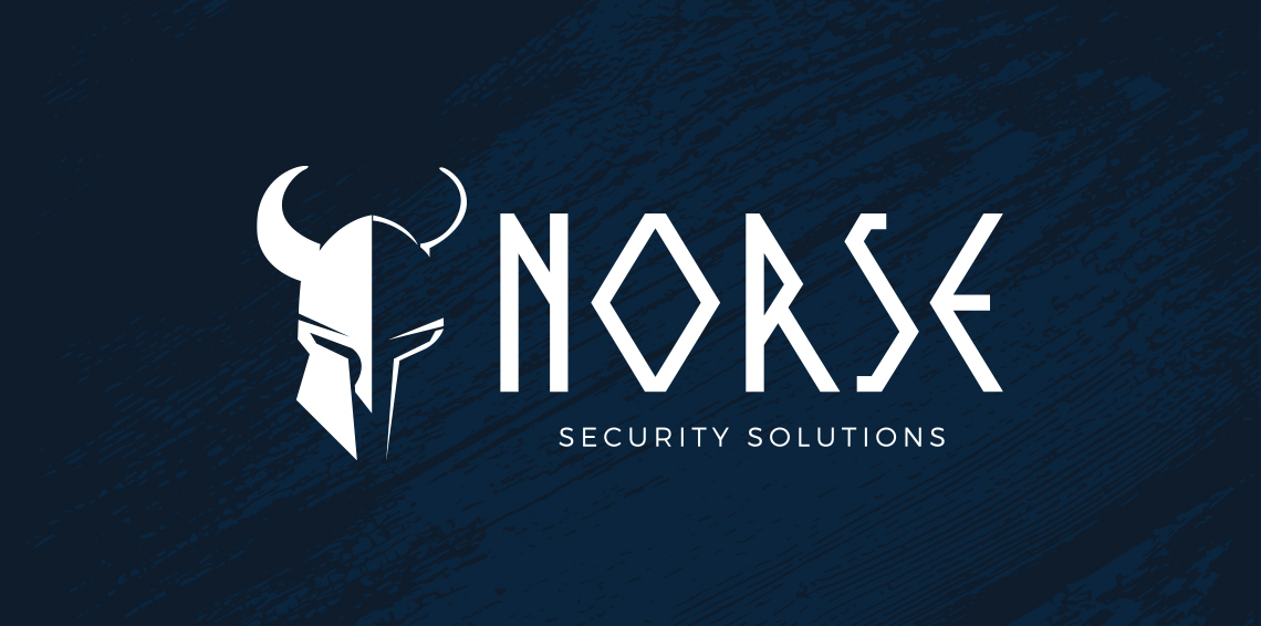
Security specialist Norse Security Solutions were looking for a total rebrand and had some strong ideas of the direction they wanted to take the look and feel of the business in. As the name suggests they were hoping to get a real Nordic theme to the brand and had thought about the use of some sort of Viking elements.
Bearing this in mind I produced their logo using an abstract style Viking helmet along with a real Nordic style font. In terms of the background, they had originally suggested plain black, but because of the style of the logo I presented them with the mixture of the dark blues to signify the ocean, which again tied in with the Viking theme that had been created.
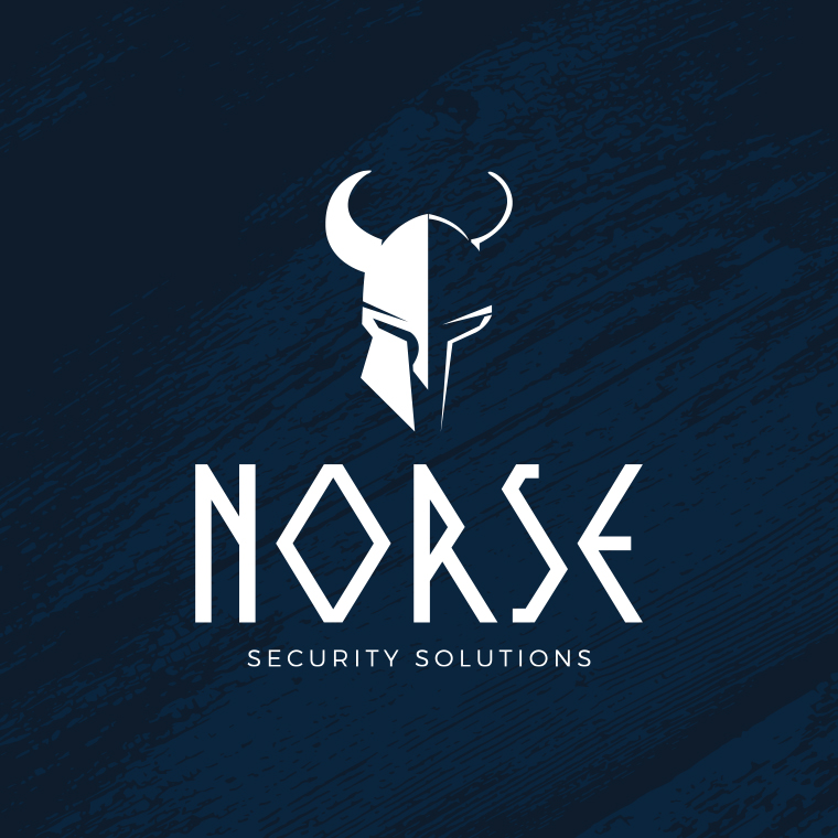
As the logo will be used in a number of different sizes and media it needed to be workable for all eventualities. Therefore I also created a more square version for times when the original landscape one won’t be suitable. I also created a reversed out version to allow the client to use the logo independently without the original blue background, again giving them more scope moving forward.
We are currently in the early stages of this project so looking forward to more work coming soon.
